Monday, February 27, 2012

Questionnaire

1) What is your business?
We help individuals and/or families plan their next vacation.

2) Describe your business in one sentence
We are a social media site that allow people to post about their experiences in various locations as well as search others posts and pictures to find their own next destination.

3) Who is your target audience?
Families, teenagers, individuals who love to travel, individuals who have been to many different places and individuals that can navigate social media websites.

4) Who are your competitors?
Notable social media websites: twitter, facebook, and notable travel websites: expedia, travelocity, priceline.

5) What makes them better/worse than your product/service?
All of these websites are well navigated and have made names for themselves. However, my website combines the idea of each to separate the mystery that can come with planning a vacation on travel websites due to countries making their area look safer etc. and hotel companies putting up fraudulent pictures to attract tourists.

6) How do you want your image to be seen in two years?
We want this company to be seen as a website that is truly accurate and helpful in guiding our subscribers to a vacation fit for them. We want it to match Twitter and Facebook's notoriety so that there is enough posts on the website about almost any place on the planet!

7) If your company was an animal, what animal would it be and why?
This company would be a bat- bats are smooth, fast animals and we want this company to be easy and fast to navigate. Bats are also known for eating pests and bugs and therefor humans aren't bothered; this relates to our social media traveling website because people will post their own experiences to help weed out the false statements made by companies just looking for money.

8) If your company/brand was a person, who would it be and why?
It would be Bill Gates. Not only was he commonly known as one of the smartest people in the world, he was extremely tech-savvy and traveled the world in his business ventures.

9) If your company/brand was an object, what would it be?
      It would be a palm tree because it is incorporated in my logo and it's the epitome of "relaxation" and that is what vacations are all about.

10) If your customer was a cartoon character, who would it be?
It would be Jimmy Neutron because he is incredibly smart and knows how to navigate computers like no other. This website would eventually tell you anything you need to know about destinations around the world, with the help of subscribers that would need to be able to make their way around the internet.

Sunday, February 26, 2012

Project 3: Lyrical Collage

This is a collage for the song California by the band Phantom Planet. For this assignment, I used 5 separate images: two clips of clouds, a background sunset picture, the car and passengers, and lastly, I added the California license plate. I liked the idea of "driving in the sun" by having a car full of adventurous teens looking as though they were on top of clouds about to reach the sun. I added the license plate later because I still wanted to incorporate California into it, somehow, since that is the name of the song and mainly the most important part. My images were hassle-free but I did have to tint the clouds to get the right shade of blue because of how dull they were to start. I really like how this came out and the contrasting color scheme that was created.

Sunday, February 19, 2012

Sunday, February 12, 2012

Project 2: Vector Illustrations

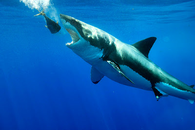
Original Photograph
 
Vector Illustration

I thought this project was really enjoyable, and I knew it was all about choosing the right photograph. To complete this illustration I used 23 layers because there were so many little pieces that I didn't want to accidentally move. Once the shark was finally done, I found doing the water to be an easier process. The bubbles, however, took a while to figure out but I liked using the pencil tool better than the pen tool and then I added different opacity throughout. After I added a gradient to the water I had to essentially redo the bubbles because the surface of the water needed to be light yet that meant the bubbles wouldn't be visible. Overall I think with projects like this you can constantly find things to work on so being a perfectionist already made this project never ending!

Monday, January 30, 2012

Project 1: Original Logos


My UTravel logo represents the website because it will be geared more towards people looking for the perfect vacation for themselves or their family. I think the palm tree and hammock symbolizes a desire for relaxation and that it what taking a vacation is all about. I used two palm trees on either side to frame the logo and draw attention inside to the name of the company. I also made sure the leaves and coconuts were different so it wasn't too symmetrical. I kept the textures smooth except for the tree trunks to give just a realistic hint to the logo and make the logo stand out that much more.

Seahorse Calligramme


Tuesday, January 24, 2012

5 Effective Logos

#1 World Wildlife Fund


WWF's logo encompasses all of the great logo basics. First, it's not too detailed so as to be recognizable at any scale. Secondly, it's extremely relevant to what the company stands for and is striving to protect. Lastly, it's effective even without color to distract from the message. I like how it always appears black and white with a white background because I think adding color to it can get too subjective. The fact that they chose a panda as the symbol of their company was smart because it touches viewers of any age, and adding a variety of animals would have been overwhelming and not as personal.
#2 Disney
Disney's logo has proved to be timeless due to it's consistency over the years. The logo works because the image is a castle that almost anyone can understand symbolizes the real castle seen at Disney World. This ensures an automatic sense of happiness when people of all ages see this logo. It's also unique because its a stylized version of Walt Disney's actual signature.
#3 Nike


Nike's logo is effective because it's one of the most simplistic logos out there. I once heard that the man who created Nike asked a girl in one of his college classes to draw him a logo and since she was in a bad mood she scribbled down this check on a piece of paper, little did she know she had just created a symbol that would represent a multi million dollar company and be recognizable worldwide. It may not have been intentional, but this logo doesn't need anything else to it- no color, no detail. It's scalable and straightforward.
#4 Toys R Us


Toys R Us' logo is fun, silly, and ultimately age-appropriate to their targeted audience. I think it wouldn't be half as effective if it was in black and white. Further more, I like the colors the company chose because they aren't geared towards one gender in specific. It's playful and appeals to all children. I think it was a smart decision to reverse the R and put a star in the center to make it not as boring. Also, since the R is backwards it almost looks as though a child wrote it which adds that much more uniqueness to it. 
#5 Playboy

Playboy's logo has also shown it's effectiveness in how memorable it is. I think the number 1 criteria for a logo is that it be good enough that a consumer will be able to spot the icon anywhere and know the name attached. What is interesting about the playboy logo is that they took an everyday animal and added a bow tie, yet today the playboy bunny image is iconic. I assume this is also the reason logos of rabbits are incredibly rare. Companies understand that Playboy has branded themselves so well that any other picture of one might trigger a connotation to Playboy instead.