Wednesday, April 25, 2012
Monday, April 9, 2012

Tuesday, April 3, 2012
5 Commercials
Red Bull Commercial
This commercial is for Red Bull products and it varies from their previous animated commercials because this is life action and the tone is extremely motivational. Their target audience is to people who want to get out there and do incredible things. The commercial has a narrator voiceover that says "the challenge of my life is to see how far I can take it" and a series of shots follow of athletes and other individuals accomplishing amazing things. The Red Bull slogan is "Red Bull gives you wings" but I think in this commercial they show that it's more like Red Bull gives wings to the unbelievable ideas you never thought you could accomplish and makes them happen. I think this is a very successful commercial.
Pedigree Commercial
This commercial is for Pedigree dog food and it's shot in live action without a narrator- just background music. The tone is happy, it's kind of suspenseful at times even though you have an idea of what is coming next, you can't help but keep watching to see the dogs actually get the treats. The targeted audience is definitely dog lovers/owners because the commercial definitely appeals to human emotions. I think that this commercial is successful because emotions are always what trigger consumers to choose one company over another. What better way to get to the heart (and wallets) than with animals?
Ikea Commercial
This commercial is for Ikea and it's shot in live action with characters on screen. There isn't a real sense of what the tone is until you finish the commercial and put all the pieces together but it's very lighthearted once you realize what happens and what company the commercial is for. The targeted audience is people with guests that may be less-than-pleased with their living spaces- but, god forbid, have the same fate as the character in the commercial. I think this commercial is successful because it's a relatable situation with a twist. They also have a few other commercials similar to this to make up a funny ad campaign about tidying up with Ikea. I think some of the most successful products are that that have a funny commercial tied to it because that's what consumers remember when choosing a company.
Old Spice Commercial
This commercial is for Old Spice body wash and it's shot in stop motion with a narrator on screen. The way the actor speaks in the commercial seems serious but with the rest of the elements in the commercial, it's definitely a comical tone. The targeted audience is for women who want their significant other to smell like the handsome man in the commercial, and for men who want the same for themselves. I think this commercial is successful because it's a hilarious over-dramatization on what you can do as a man with Old Spice on but still sells the product well.
Mastercard Commercial
This commercial is for Mastercard and it's shot in live action with characters on screen. The tone is comical especially once you realize it's almost a parody of other Mastercard commercials even though it's done by the company, themselves. The targeted audience is for people that have seen Mastercard commercials in the past so that it's clear what their alluding to. I think this commercial is successful because it's a comical twist on the typical Mastercard phrase that everyone knows and loves.
Tuesday, March 27, 2012


Monday, March 19, 2012

Wednesday, March 14, 2012


Monday, March 12, 2012
5 Business Card Sketches

Business Card #1
I like how this design has minimal writing so the graphics are what catches your attention and the test is to see if people are intrigued enough by the minimal text to log on to the website and find out more.
I like how this design has minimal writing so the graphics are what catches your attention and the test is to see if people are intrigued enough by the minimal text to log on to the website and find out more.

Business Card #2
I got sick of designing business cards with just the same logo so in this one i added some coconuts on the sides to take up more horizontal space and not make the sides look so empty- especially since they're white. I like the text at the top inviting people of all traveling experience to become a member of the website. Finally I added a zoomed in frame of the text "UTRAVEL" within the logo, on the back side.

Business Card #3
I started to get tired of the white but I thought that adding a plain color with the already bright color of the logo itself would either not match or be too much. I started exploring with gradients as a compromise and really liked the brown fading to white. I chose a different font in this one and thought it looked kind of like sticks on a beach making words and just thought it matched well.

Business Card #4
I decided through a few sketches I might simply put the logo itself on the front of the business card and have the information on the back so that the logo isn't overshadowed. I added green on the back for some color and a few coconuts to tie in the logo. I felt it was a good idea to add the question "where will u go next" for several reasons: to involve the reader, show that the destinations are endless, and to tie in the "u" from the logo.

Business Card #5
I wanted to try out another gradient business card and there are a few things in this one that I want to incorporate into my final card. I like how "u search" and "u decide" and texts on the card to relate back to the website name and explain that its a search engine. I might want to add "u discuss" somewhere in it though to show that it's a social media site, not just a regular travel website. I left the back blank but I think I'm going to end up choosing the front to be less text and save that for the back instead.
Monday, February 27, 2012
Questionnaire
1) What is your business?
We help individuals and/or families plan their next vacation.
2) Describe your business in one sentence
We are a social media site that allow people to post about their experiences in various locations as well as search others posts and pictures to find their own next destination.
3) Who is your target audience?
Families, teenagers, individuals who love to travel, individuals who have been to many different places and individuals that can navigate social media websites.
4) Who are your competitors?
Notable social media websites: twitter, facebook, and notable travel websites: expedia, travelocity, priceline.
5) What makes them better/worse than your product/service?
All of these websites are well navigated and have made names for themselves. However, my website combines the idea of each to separate the mystery that can come with planning a vacation on travel websites due to countries making their area look safer etc. and hotel companies putting up fraudulent pictures to attract tourists.
6) How do you want your image to be seen in two years?
We want this company to be seen as a website that is truly accurate and helpful in guiding our subscribers to a vacation fit for them. We want it to match Twitter and Facebook's notoriety so that there is enough posts on the website about almost any place on the planet!
7) If your company was an animal, what animal would it be and why?
This company would be a bat- bats are smooth, fast animals and we want this company to be easy and fast to navigate. Bats are also known for eating pests and bugs and therefor humans aren't bothered; this relates to our social media traveling website because people will post their own experiences to help weed out the false statements made by companies just looking for money.
8) If your company/brand was a person, who would it be and why?
It would be Bill Gates. Not only was he commonly known as one of the smartest people in the world, he was extremely tech-savvy and traveled the world in his business ventures.
9) If your company/brand was an object, what would it be?
It would be a palm tree because it is incorporated in my logo and it's the epitome of "relaxation" and that is what vacations are all about.
10) If your customer was a cartoon character, who would it be?
It would be Jimmy Neutron because he is incredibly smart and knows how to navigate computers like no other. This website would eventually tell you anything you need to know about destinations around the world, with the help of subscribers that would need to be able to make their way around the internet.
Sunday, February 26, 2012
Project 3: Lyrical Collage

This is a collage for the song California by the band Phantom Planet. For this assignment, I used 5 separate images: two clips of clouds, a background sunset picture, the car and passengers, and lastly, I added the California license plate. I liked the idea of "driving in the sun" by having a car full of adventurous teens looking as though they were on top of clouds about to reach the sun. I added the license plate later because I still wanted to incorporate California into it, somehow, since that is the name of the song and mainly the most important part. My images were hassle-free but I did have to tint the clouds to get the right shade of blue because of how dull they were to start. I really like how this came out and the contrasting color scheme that was created.
Sunday, February 19, 2012


Sunday, February 12, 2012
Project 2: Vector Illustrations
Original Photograph
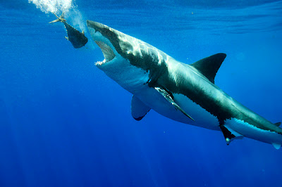
Vector Illustration

I thought this project was really enjoyable, and I knew it was all about choosing the right photograph. To complete this illustration I used 23 layers because there were so many little pieces that I didn't want to accidentally move. Once the shark was finally done, I found doing the water to be an easier process. The bubbles, however, took a while to figure out but I liked using the pencil tool better than the pen tool and then I added different opacity throughout. After I added a gradient to the water I had to essentially redo the bubbles because the surface of the water needed to be light yet that meant the bubbles wouldn't be visible. Overall I think with projects like this you can constantly find things to work on so being a perfectionist already made this project never ending!
Monday, January 30, 2012
Project 1: Original Logos

My UTravel logo represents the website because it will be geared more towards people looking for the perfect vacation for themselves or their family. I think the palm tree and hammock symbolizes a desire for relaxation and that it what taking a vacation is all about. I used two palm trees on either side to frame the logo and draw attention inside to the name of the company. I also made sure the leaves and coconuts were different so it wasn't too symmetrical. I kept the textures smooth except for the tree trunks to give just a realistic hint to the logo and make the logo stand out that much more.

Tuesday, January 24, 2012
5 Effective Logos
| #1 World Wildlife Fund WWF's logo encompasses all of the great logo basics. First, it's not too detailed so as to be recognizable at any scale. Secondly, it's extremely relevant to what the company stands for and is striving to protect. Lastly, it's effective even without color to distract from the message. I like how it always appears black and white with a white background because I think adding color to it can get too subjective. The fact that they chose a panda as the symbol of their company was smart because it touches viewers of any age, and adding a variety of animals would have been overwhelming and not as personal. |
| #2 Disney |
Disney's logo has proved to be timeless due to it's consistency over the years. The logo works because the image is a castle that almost anyone can understand symbolizes the real castle seen at Disney World. This ensures an automatic sense of happiness when people of all ages see this logo. It's also unique because its a stylized version of Walt Disney's actual signature.
| #3 Nike Nike's logo is effective because it's one of the most simplistic logos out there. I once heard that the man who created Nike asked a girl in one of his college classes to draw him a logo and since she was in a bad mood she scribbled down this check on a piece of paper, little did she know she had just created a symbol that would represent a multi million dollar company and be recognizable worldwide. It may not have been intentional, but this logo doesn't need anything else to it- no color, no detail. It's scalable and straightforward. |
| #4 Toys R Us Toys R Us' logo is fun, silly, and ultimately age-appropriate to their targeted audience. I think it wouldn't be half as effective if it was in black and white. Further more, I like the colors the company chose because they aren't geared towards one gender in specific. It's playful and appeals to all children. I think it was a smart decision to reverse the R and put a star in the center to make it not as boring. Also, since the R is backwards it almost looks as though a child wrote it which adds that much more uniqueness to it. |
| #5 Playboy Playboy's logo has also shown it's effectiveness in how memorable it is. I think the number 1 criteria for a logo is that it be good enough that a consumer will be able to spot the icon anywhere and know the name attached. What is interesting about the playboy logo is that they took an everyday animal and added a bow tie, yet today the playboy bunny image is iconic. I assume this is also the reason logos of rabbits are incredibly rare. Companies understand that Playboy has branded themselves so well that any other picture of one might trigger a connotation to Playboy instead. |
Monday, January 23, 2012
5 Company Ideas
1. This company would sell makeup thats tone changes based on what season it is. You would never have to look orange in the winter or pale in the summer because the color would automatically vary based on what season it is. There would be an online website where the customer would answer some questions and be able to customize the looks they are trying to achieve. The technology may have to be heat-sensitive or UV-sensitive so that the makeup can tell what season it is.
2. This company would run a social media type website where each page is a different country and people can subscribe to different pages based on where they are interested in traveling. On each page photos can be uploaded, people can post their experiences and different places they went, and also advertising can be bought by hotels and airlines.
3.This company would be a high fashion photography company based completely underwater. The locations would vary from rivers in the amazon to deep in exotic oceans. The purpose of placing this with high fashion photography is the drastic juxtaposition and unexpected look. People's attention will be drawn to this page in a magazine and this style will begin to be known as solely from my company.
4. This company would sell music players like iPods thats purpose is for working out. It gets frustrating when you're running and a slow song comes on and you have to stop to change the song. This device would offer technology that syncs with your body to tell how fast you're going to change the song accordingly.
5. This company would offer the ability to rent domestic animals for up to 1 week. The reason this would be successful is because many people, for example, don't know what kind of dog they want. If they rent one for a few days, they can get to know that breed's behavior, if it sheds, etc. It would also be profitable because there would be an ability to buy that animal after the rent period is up. There is a strong change these customers will get attached and be persuaded to buy that new pet.
Sunday, January 22, 2012
About Me
Welcome to Shannon's blog!
I am a sophomore student at the University of Tampa studying Advertising and Public Relations. I hope to learn as much as possible out of my art and communications classes so I receive a well rounded education on the creative and technical aspects of advertising.
Although originally from Maine, I enjoy spending time in warm Tampa weather- going to the beach, bike riding, and relaxing anywhere with a great view:)
After graduating, I hope to travel to the west coast and make a career out of my studies in advertising. My ideal job would be at a successful advertising agency or working as a creative director of a magazine.
I am a fun loving, outgoing individual but even more so, down to the earth, independent and highly dedicated to preparing a life after college at a thriving business!
Subscribe to:
Posts (Atom)